Same TRUCK, New Engine — Catalog Book

Publication Design

2025

  • Print

This summer, we were reconnected with Tokuhiko Kise, founder of TRUCK Furniture in Osaka, Japan. Tok has always been an inspiration to us, ever since our friend Justin Chung had featured him in the first volume of Faculty Department. In 2014, we visited Japan as an inspiration trip and it was on this trip that we met Tok for the first time. Seeing the TRUCK showroom and having coffee at Bird in many ways inspired us to eventually open our retail store, SORT. From Making Truck to TRUCK Nest, Tok’s books have been a grounding source that we often come back to whenever we were about to make a bigger business decision.

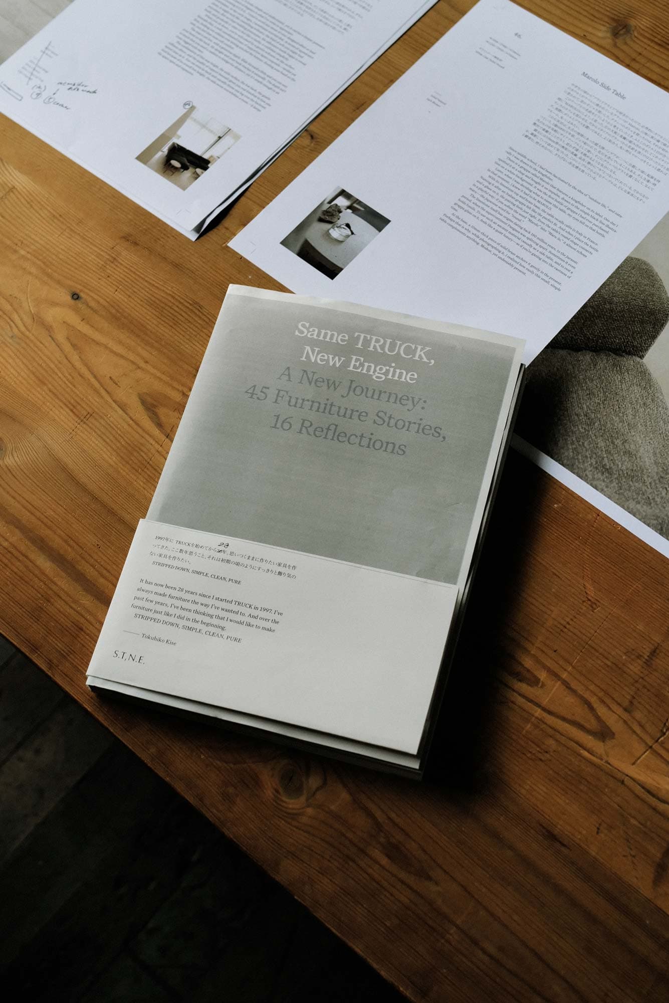
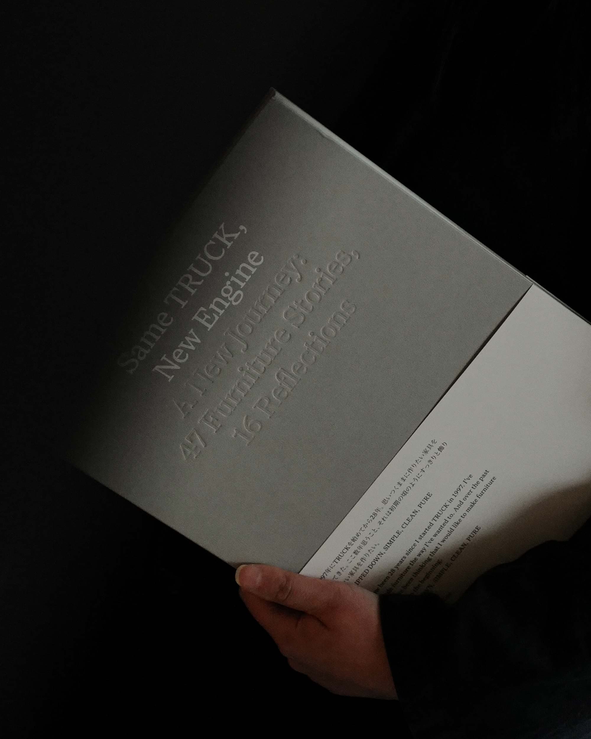
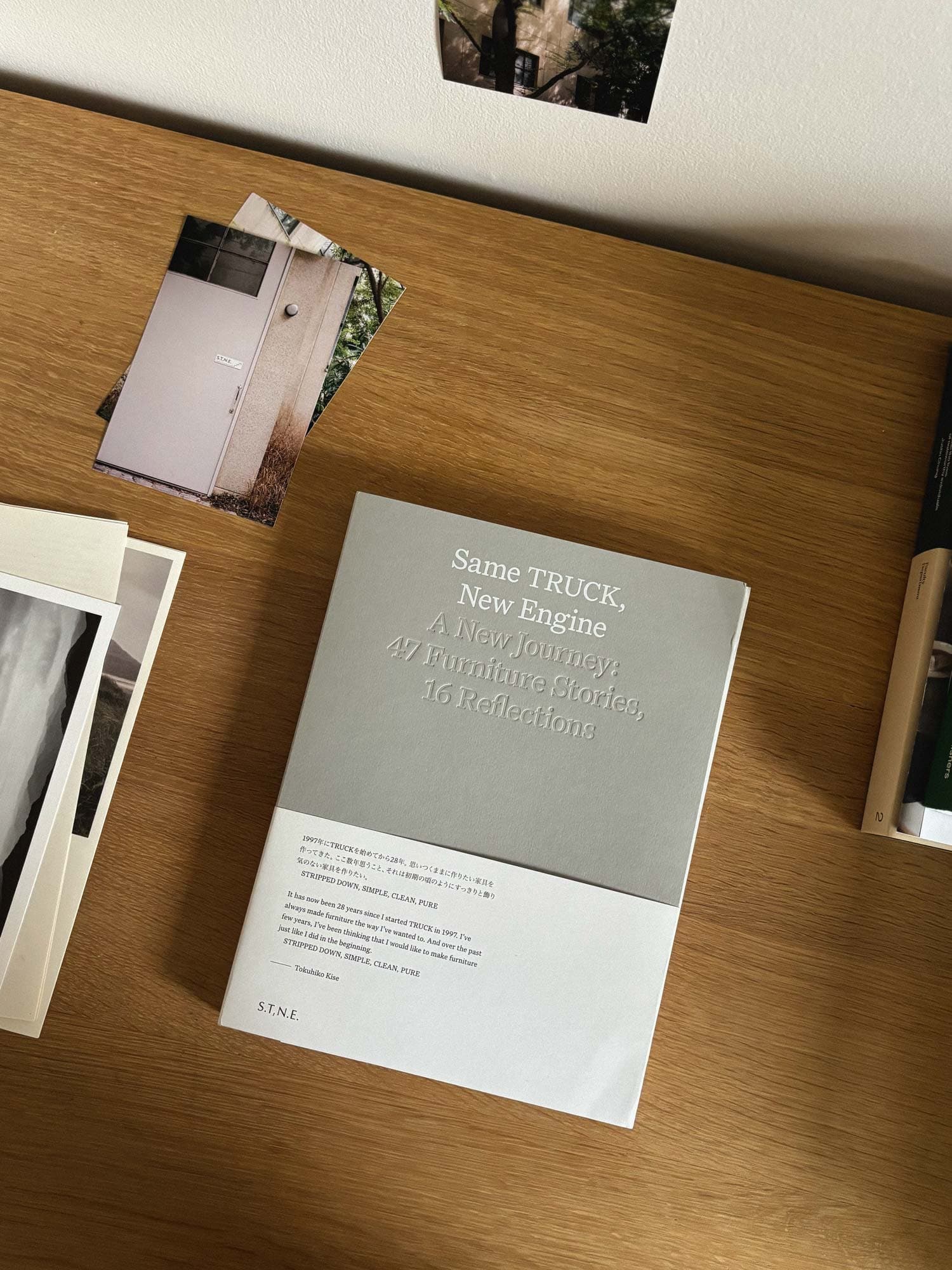
After making furniture for 30+ years, Tok told us he had reached a turning point both in work and life. He described his desire to live more stripped down and simple—a return to the essential. Like most designers, he too was inspired by Dieter Ram’s ‘Less but better’ philosophy. This was the starting point for his new furniture brand, S.T,N.E. (Same TRUCK, New Engine).

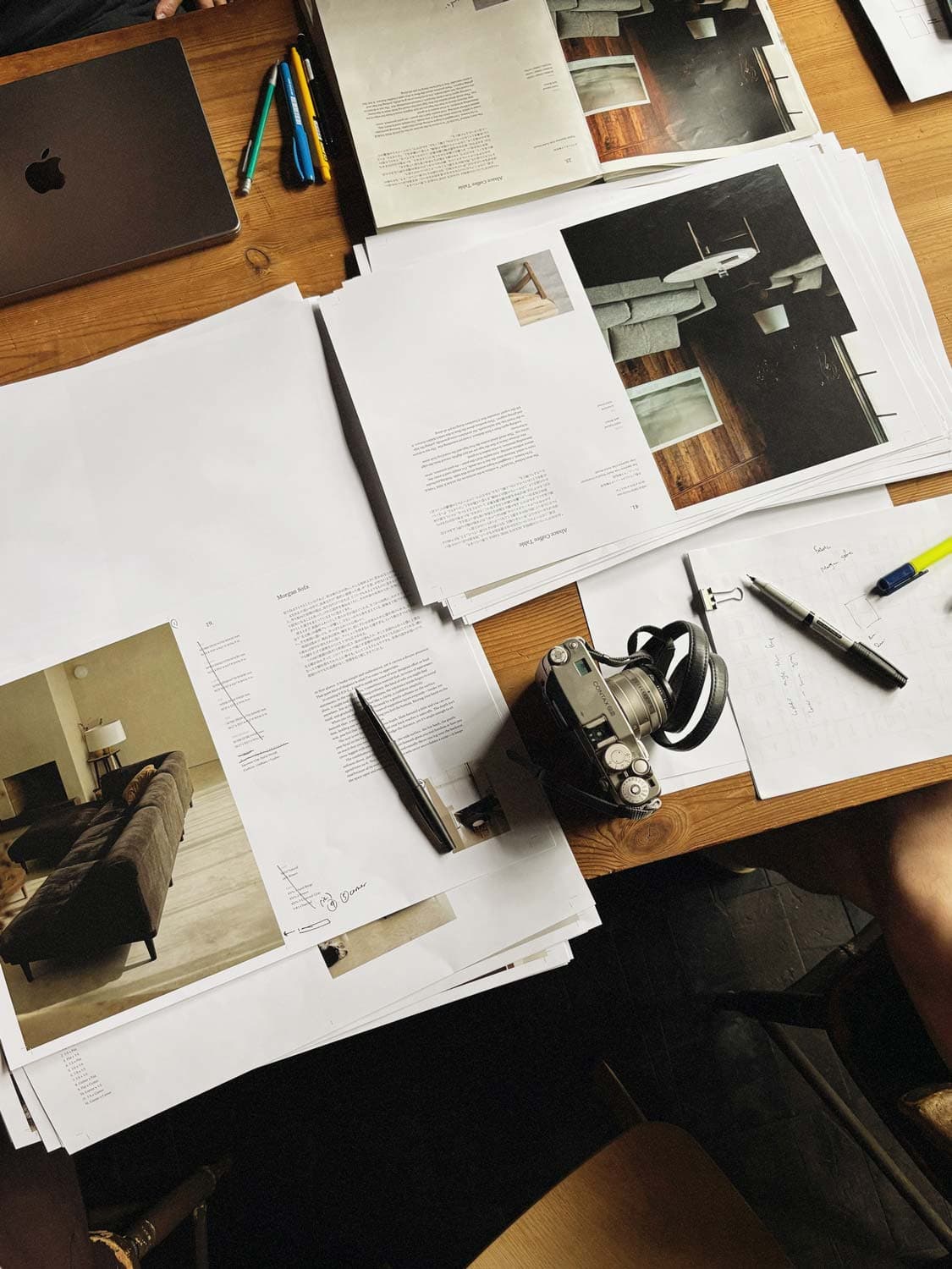
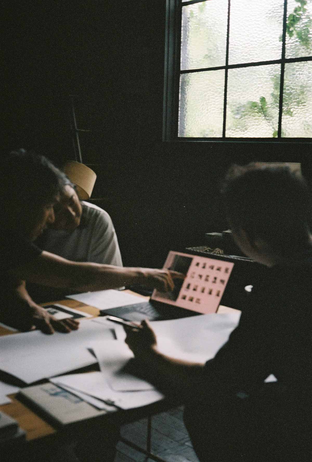
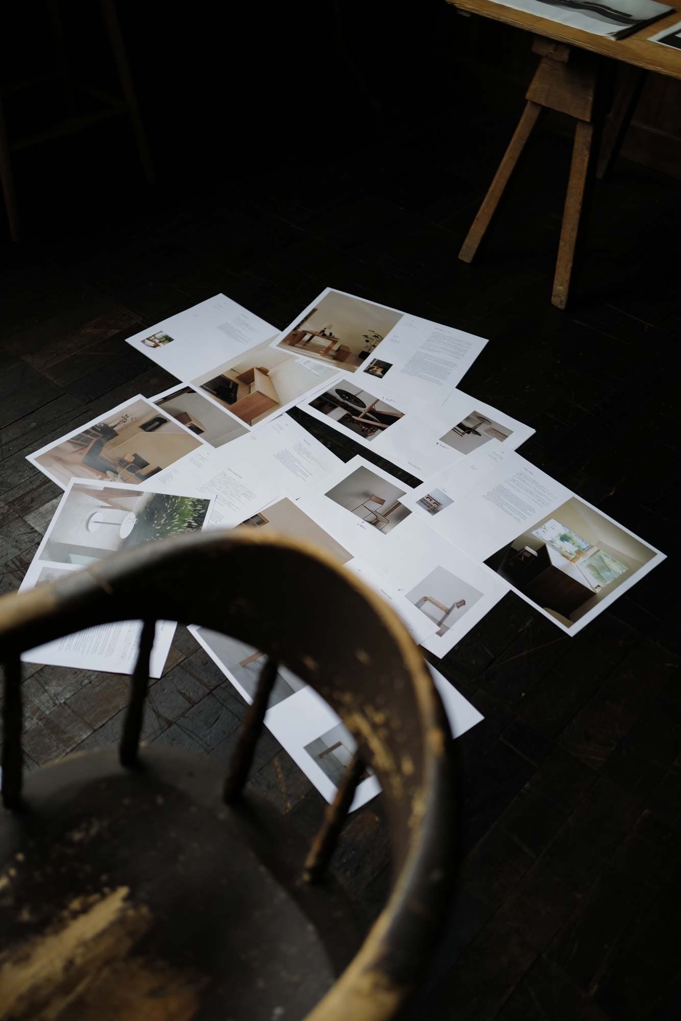
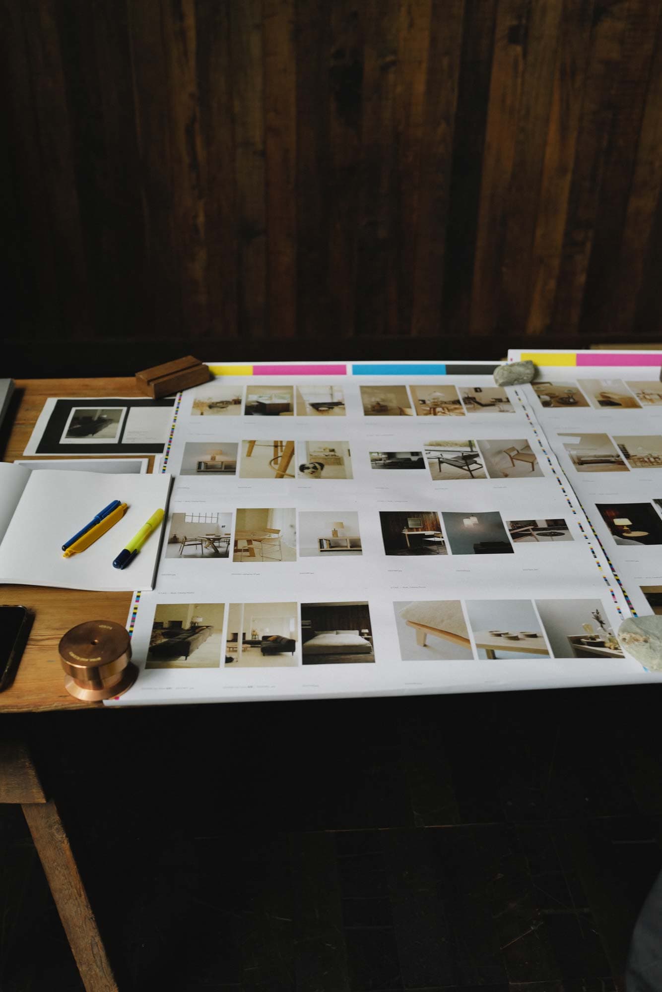
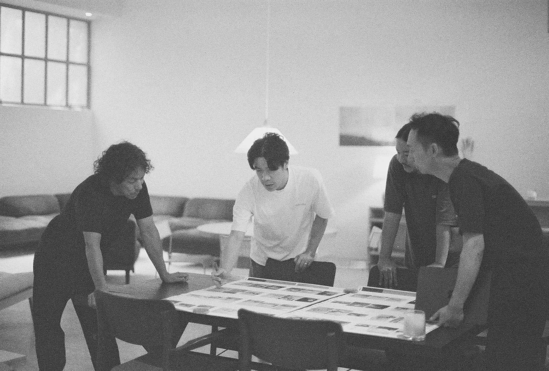
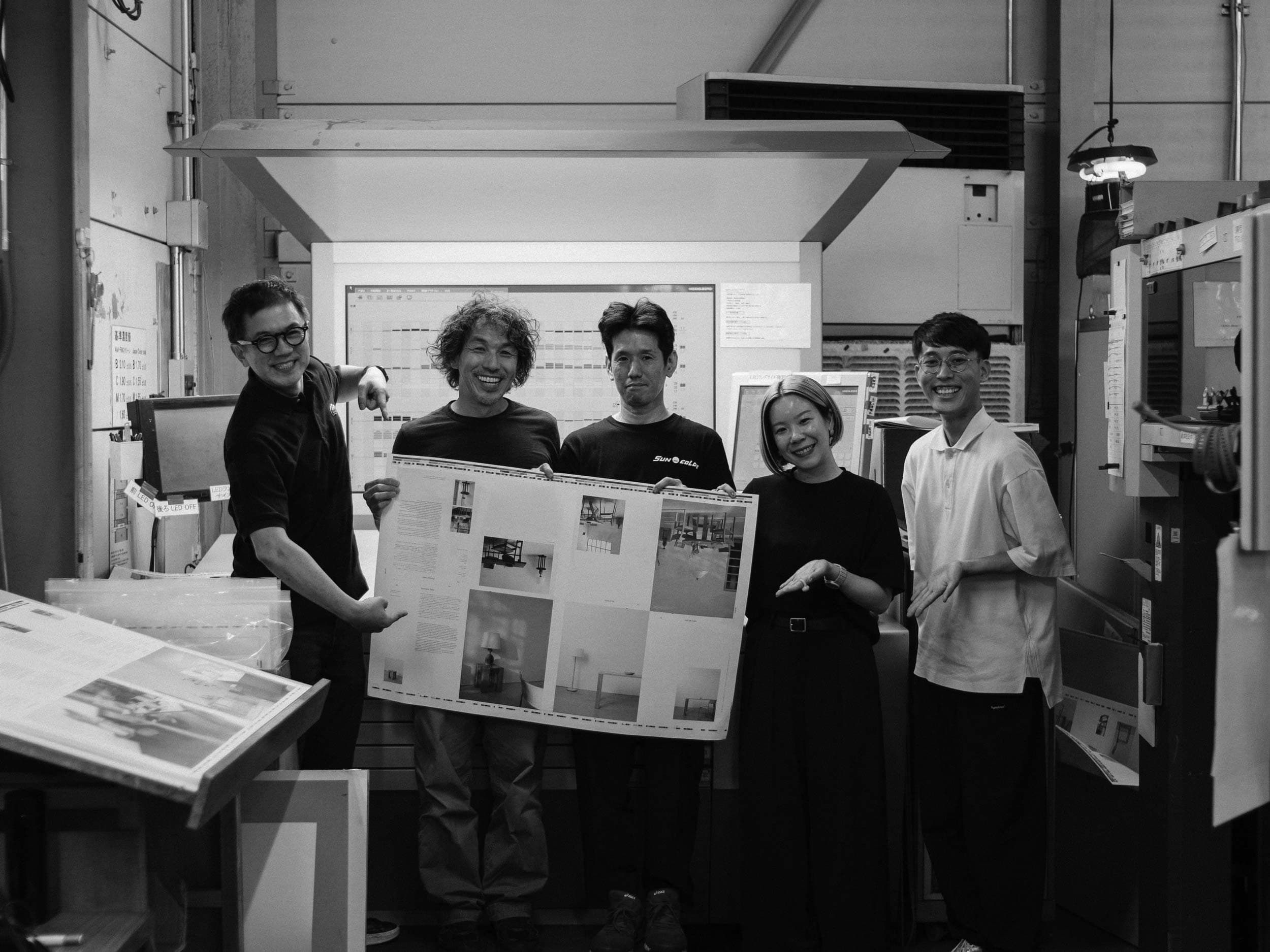
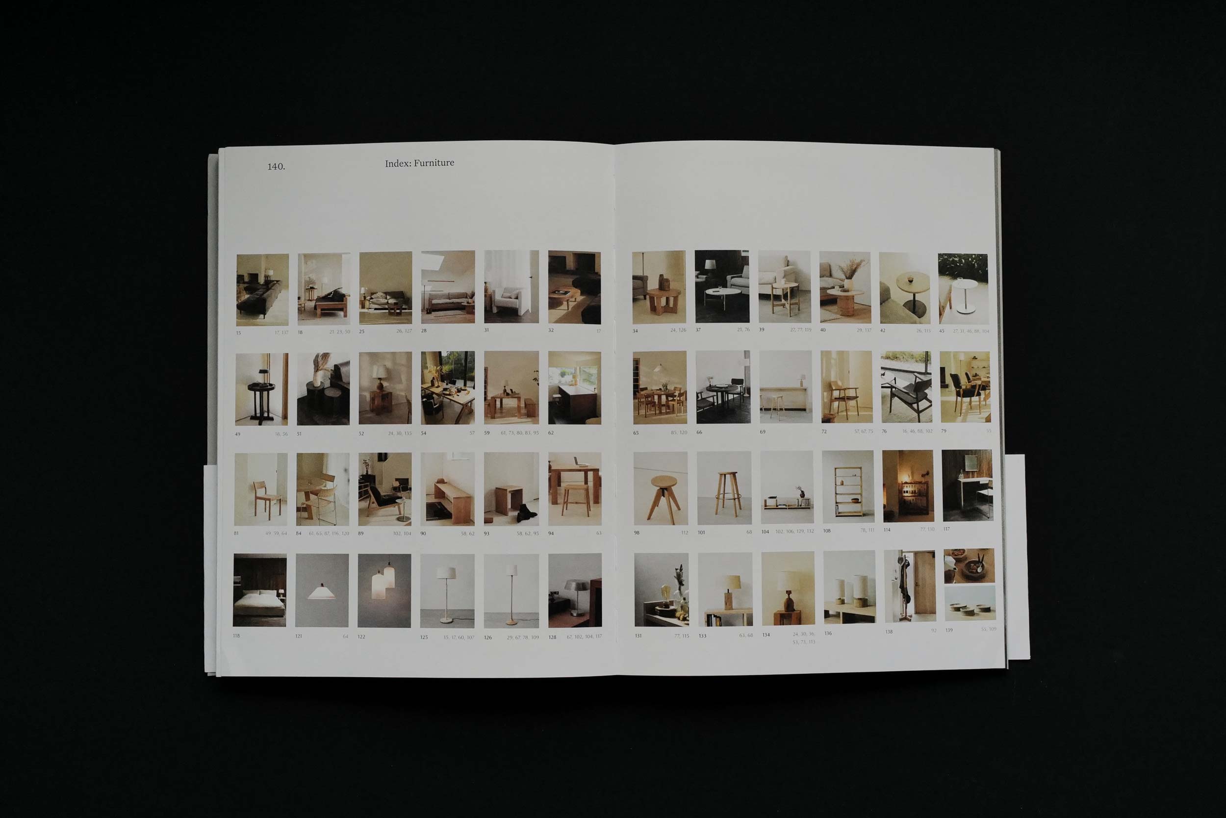
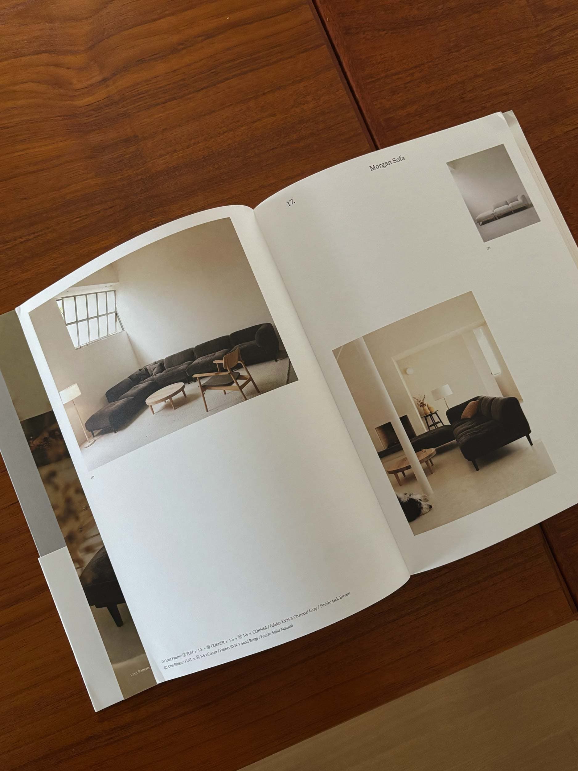
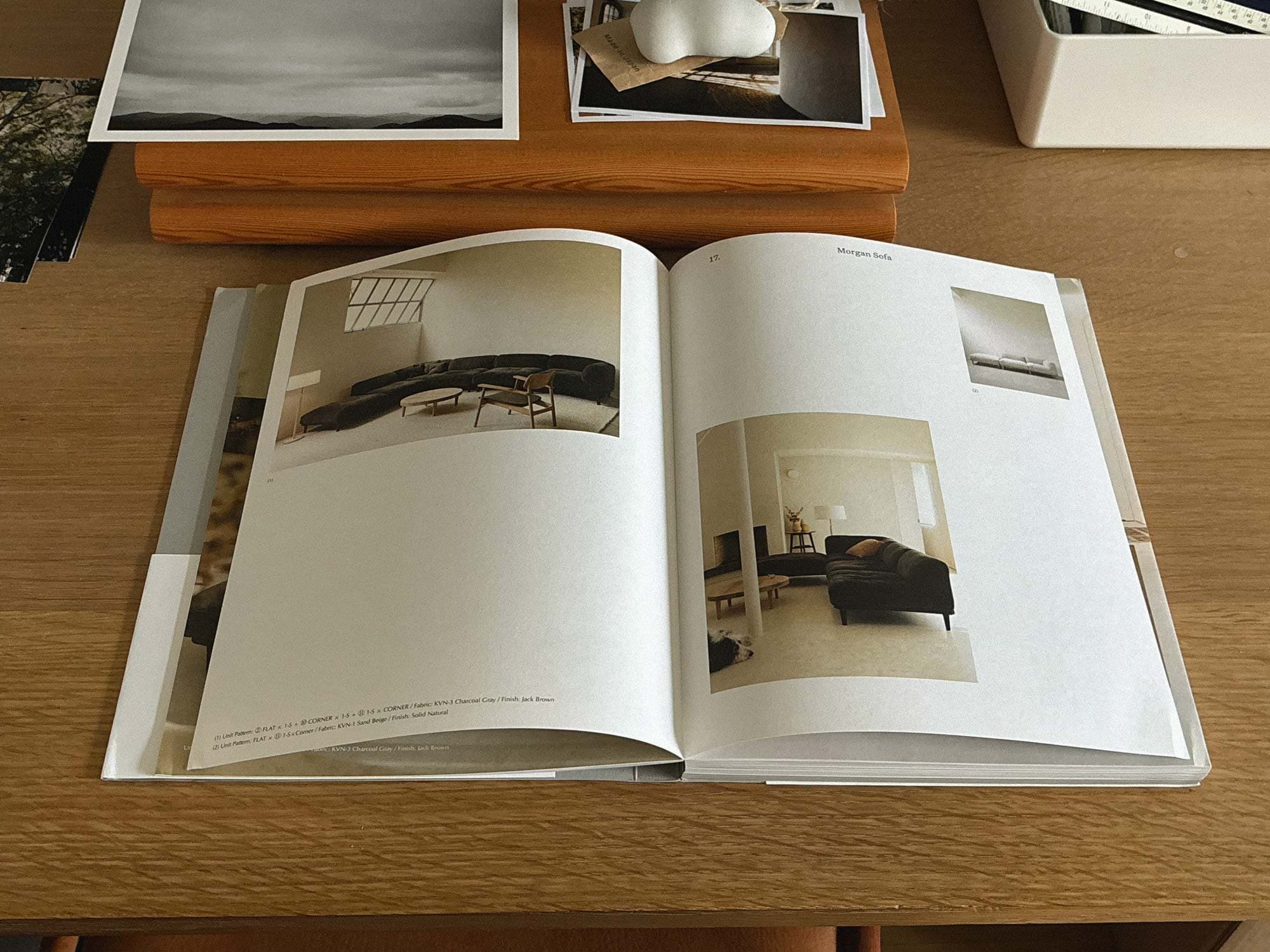
Tok reached out to us to help redesign the S.T,N.E. website and create print material for an exhibition in Tokyo at the beginning of November. One of the main print components we were commissioned to work on was a printed booklet, which later grew into a 200 page book featuring 47 Furniture pieces and 16 essays.

1
  • 1

    Ideating with Tok Kise and Kosuke Inoue in Tok's office in Osaka.

Design

With the deadline set for end of October, our team needed to move quickly to ensure we were able to deliver on time. The book would be split in two sections: a catalog of the S.T,N.E. furniture collection, and a set of essays by Tok himself and along with three essays by close friends. Our team first established an overall layout design for the essays and then created a complimentary layout for the catalog. With the support of our good friend Kumiko Noda, we decided to use a grey paper stock for the essays component of the book, while the catalog side would be printed on a warm white stock. This common and simple method allowed readers to easily navigate between the two sections when looking at the spine. We went with a Swiss binding method to allow the book to open completely flat when viewing.

At the start of the design process, S.T,N.E. had already established URW Classico as their brand typeface, mainly used for the wordmark. For the design of the book, our team felt that using a serif would help improve the reading experience and also add a new tone of voice to the brand. We settled on Untitled Serif, designed by Klim Type Foundry. To us, Untitled Serif possessed the right balance as a neutral yet warm and familiar contemporary font. Our selection of Untitled Serif was also made in consideration of how it would look when paired with Hiragino Mincho Pro ().

One of the main design considerations was for balancing the overall layout of both the Japanese text and English text—particularly when the lengths of the text would be quite different. With a 10 column grid set in place, we created a system to set the Japanese text as 6 columns width, and the English text as 5 columns width when the English text was much longer. This allowed us to set the English text as 2 columns and bring the length of all the text blocks closer together.

Once the book was near complete, our team decided to make a trip to Osaka to do a two-day work session with Tok and his colleague Kosuke Inoue. This short trip proved to be essential in helping us iron out the last decisions on the book cover and index section of the book. With the tight deadline, our team, along with S.T,N.E. also worked on the book during after hours while in Japan, making this book truly a labour of love from all parties involved.

Test cover and bellyband, printed at S.T,N.E. showroom

Top: All printed sheets, showing the grey and white papers stacked. (Photo by Shinohara Shiko) Right: S.T,N.E., SunM Color team, Shinohara Shiko, Kumiko Noda (cc. Kosuke Inoue)

Printing/Binding

The S.T,N.E. catalog book was printed by SunM Color printers in Kyoto and binding was done by Shinohara Shiko in Tokyo. We were also very fortunate to have our friend Kumiko Noda on board as our print coordinator in Japan while our team returned back to Vancouver. The final printed book was completed just in time for S.T,N.E.’s book launch/talk at Daikanyama T-Site in Tokyo, and made available at S.T,N.E.’s Tokyo exhibition this past November.

In addition to the catalog book, our team also provided design services for the exhibition signage, ads, and print collateral.

Despite the challenges of different timezones, language, and terminology, seeing how this book came together with the efforts of all parties working collaboratively reminded us of just how special these projects can be.

We are also immensely grateful to have had our designer Aily Nishioka on this project providing both design work and translation/communication support.

Print technican cutting print sheets (cc. Shinohara Shiko)