Atelier Fen

Brand Identity, Website Design, Development

2024

  • Branding,

  • Identity,

  • Website

Photo cc: Atelier Fēn

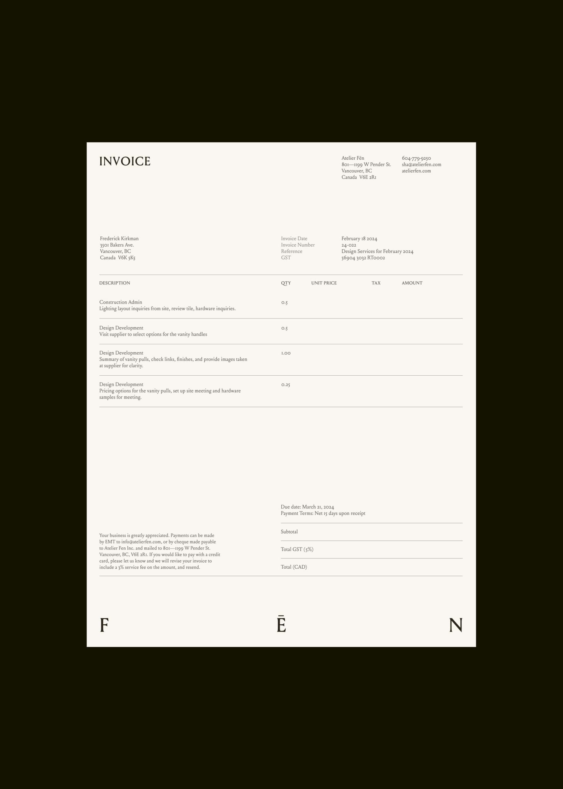
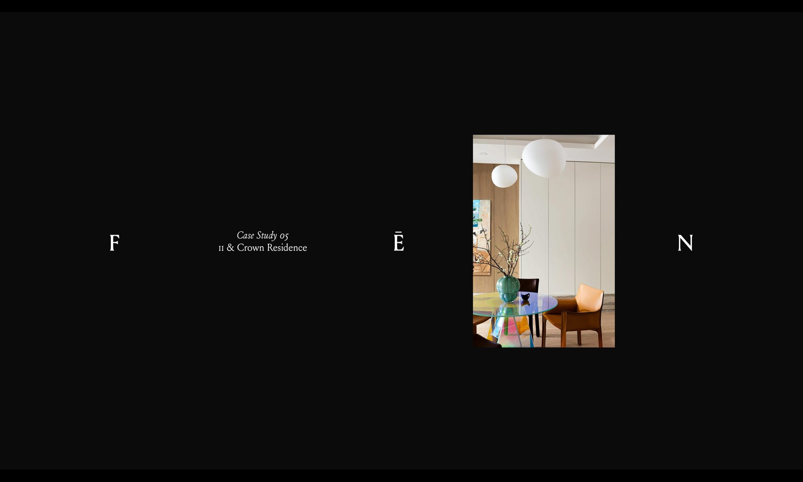
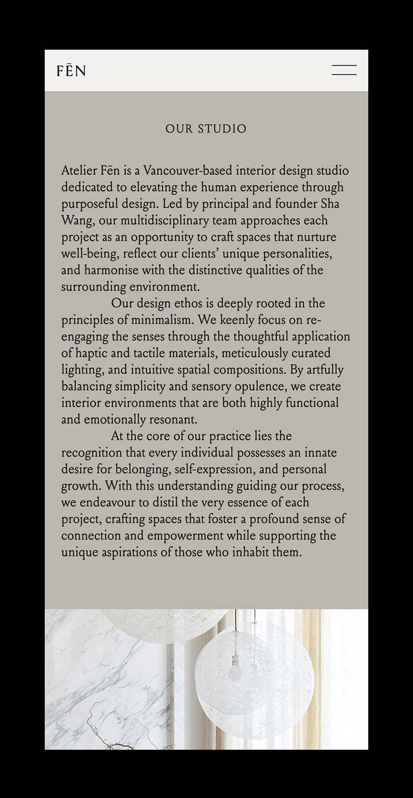
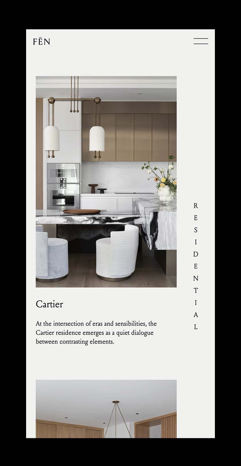
We were connected with Sha Wang during the fall of 2023. Sha had established her interior design practice, Space 9 for a number of years and quickly gained international recognition for her work. However, Sha felt that the name of the practice was no longer reflective of her work and lacked a strong meaning behind it. Our work with Sha involved the entire process, from discovery to name development, identity design to website design, and finally web development.


Name Development

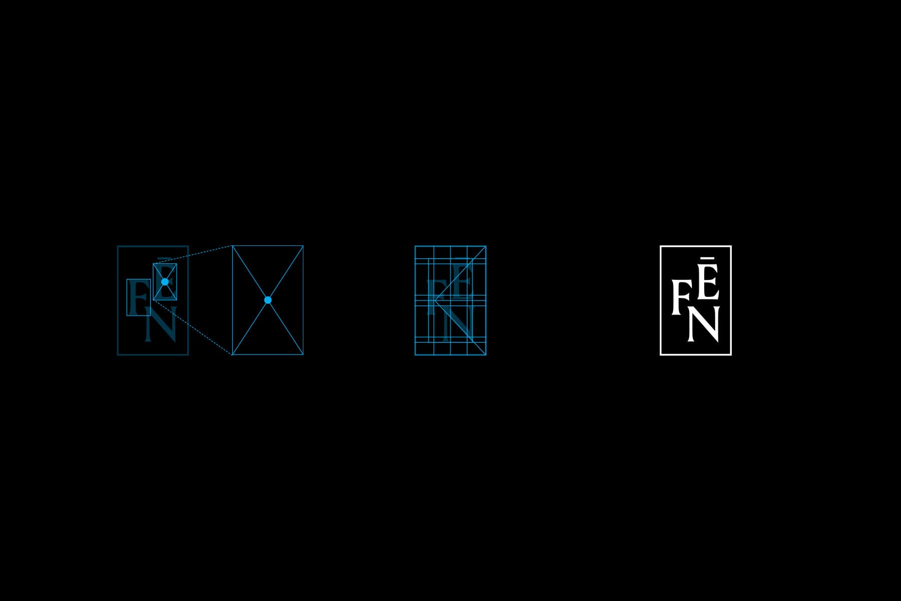
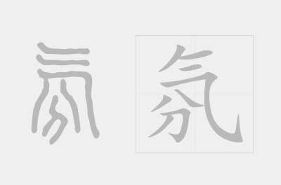
As we began the name development process, one common thread we had in mind was to create a name that was reflected the unique qualities of Sha’s work—a fine balance of international design sensibilities with Asian influences. During our name development process, over 30+ name options were generated and then further filtered to the final selection. Our team came across the Chinese character (fēn), which when paired with various characters provided the meaning of ambience, atmosphere—a feeling. This name connected well with Sha’s description of her work—spacial, visual, material considerations all to create a particular feeling within a space. As all of Sha’s work is custom and tailored to each client, we proposed the addition of the french word “Atelier” to pair with fēn—a combination of a European and Chinese word, an “atmosphere workshop”.

⮤ Dynamic wordmark system

Identity Design

The design for the brand identity focuses on this idea of ‘atmosphere’, exploring the matter of spatiality and the intangible qualities of the in-between space. To reflect this spatial concept, we created a dynamic wordmark that can be spaced out to span the width of the page while also being used as a standalone mark. The wordmark is set in Louize, a typeface that we felt accurately expressed the blend of contemporary and natural qualities in Sha’s design. The sharpness in the letterforms of Louize also reflect angular qualities in Chinese characters, making the typeface a well balanced display of western and eastern influences in the brand’s tone of voice.

As part of the identity, we created a monogram seal that can be used interchangeably with the wordmark. The design of the monogram was inspired by both traditional Chinese ink seals as well as western seals. The frame of the seal is sized proportionally to the size of the letter F and E while a grid was also used to establish the alignment and arrangement of the letters within the frame.

Early mindmap during discovery phase

Website Design

The established brand identity was then translated to the Atelier Fēn website using a 12 column grid layout. A subtle scroll animation was used for the wordmark on the homepage to visualize the dynamic wordmark treatment. The project page includes five content modules which allows Sha and her team to display each project differently with some variation while finding the module that would best suit the content. Brand colours are subtly and playfully used through the site to provided structure and division of space. On each project page, a brand colour can be selected and used as the background colour that appears before the full bleed image fades in at the top. The Atelier Fēn website was built as a headless website, ensuring fast loading time and improved security.